PROJECT OVERVIEW
Pulse+ Beverages Co. is launching a premium energy drink designed for individuals who train hard, work late, and operate in high-performance environments.
The brand sits at the intersection of performance energy, fitness culture, and modern street/lifestyle aesthetics. The objective is to establish a distinct identity in a saturated energy drink market dominated by extreme, outdated, or overly generic branding. We are seeking a cohesive visual identity and campaign system for launch.
OBJECTIVE
Develop a bold, modern, and commercially viable brand and campaign that:
Positions Pulse+ as a premium performance energy drink,Differentiates it through design, tone, and visual discipline,Appeals to fitness-driven and high-performance lifestyles, Works seamlessly across digital, social, and retail environments, Balances structured design systems with high-energy visual execution
CONCEPT
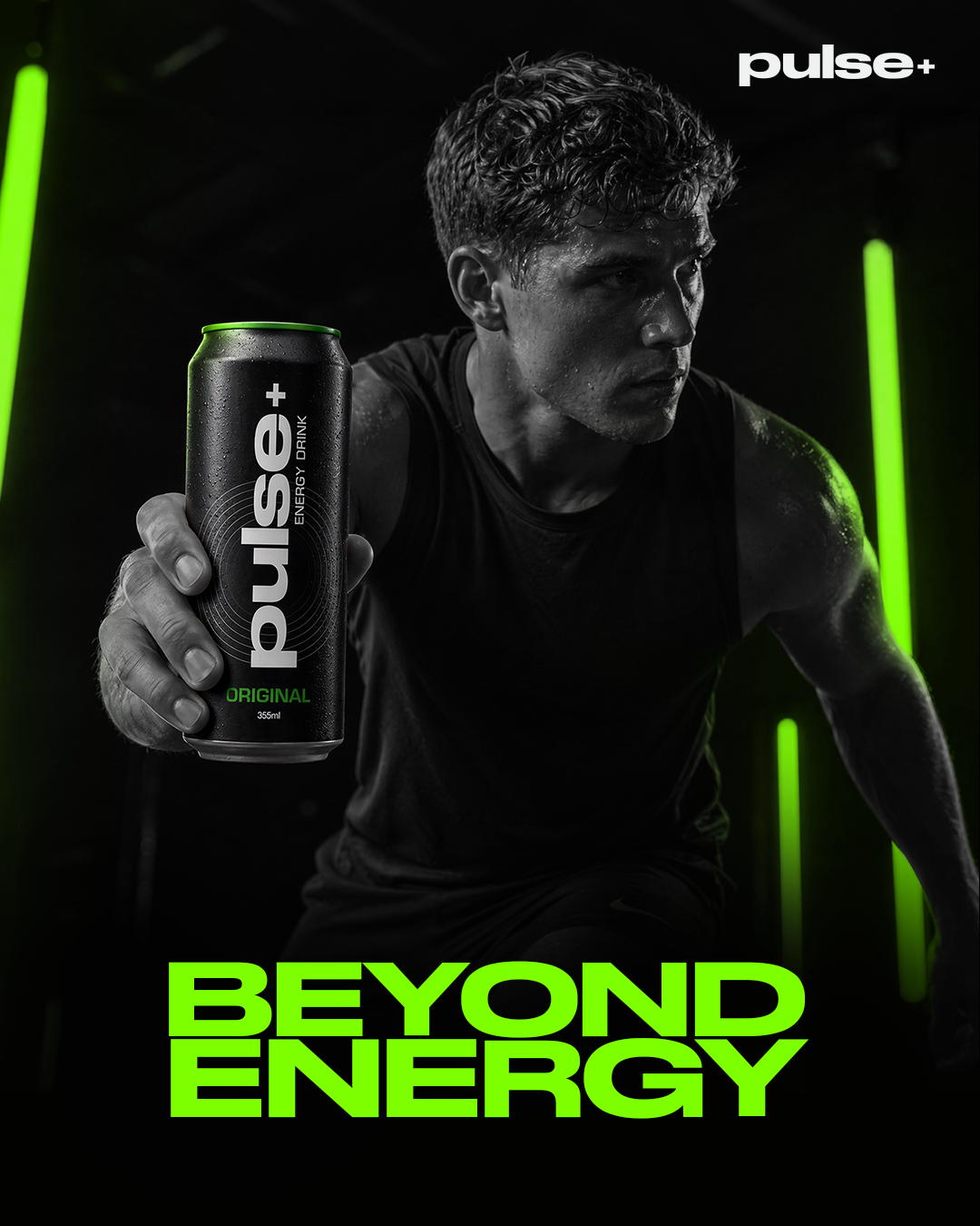
Pulse+ is built around the idea of energy as an activation state rather than a simple consumable product.
Instead of relying on exaggerated “extreme energy” branding, the concept reframes energy as a controlled switch a moment where focus, discipline, and performance are turned on.
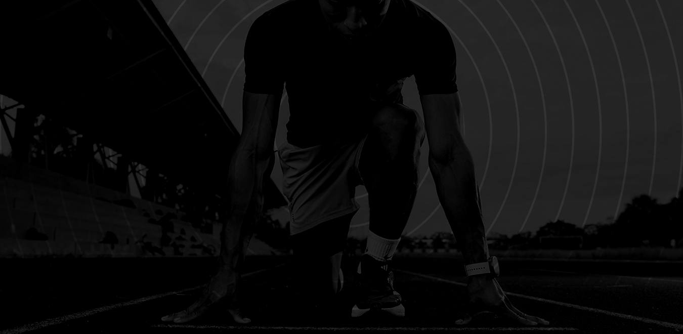
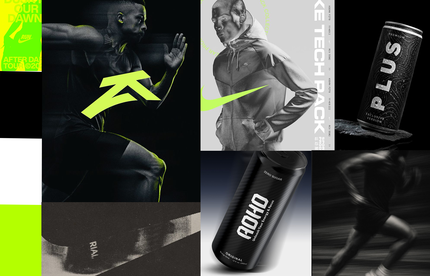
The campaign explores the intersection of fitness culture, combat sports mentality, and modern urban lifestyle. It positions Pulse+ not as a stimulant, but as a trigger for output something that aligns with high-performance environments where consistency and control matter more than hype.
IDEATION
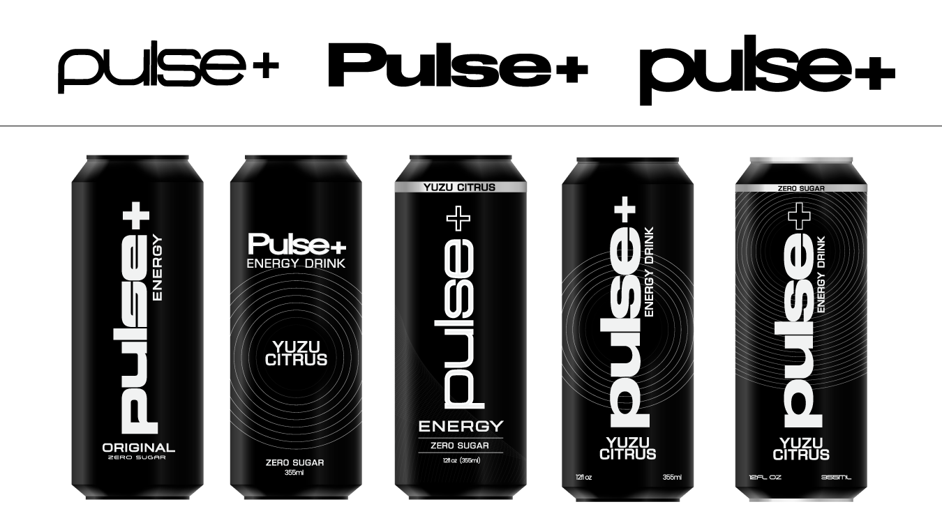
This phase explored early directions across logo, can design, and overall visual composition.
Initial sketches focused on developing the Pulse+ identity, testing wordmark styles, symbol integration, and typographic tone. In parallel, can design explorations examined layout structure, branding placement, and how the product could stand out within a minimal system.
Composition and layout studies were used to explore how the product and environment interact, balancing clean structure with moments of intensity.
TARGET AUDIENCE
Primary audience:
-18–35 year olds ,Gym-goers and fitness,focused individuals,
Creatives and high-output professionals , Consumers influenced by streetwear and sport
Secondary audience:
Students and professionals seeking focus and energy, Lifestyle consumers beyond traditional athletes

BRAND POSITIONING
Pulse+ is positioned as: A high-performance energy drink built for discipline, focus, and sustained output.
Brand attributes: Bold and confident | Minimal, but impactful | Performance-led rather than gimmick-driven | Culture-aware without chasing trends | Clean structure with controlled intensity

VISUAL DIRECTION
Clean Commercial Foundation
-Strong grid systems and layout structure
-Clear typography hierarchy
-Controlled, limited colour palette
-High readability and brand clarity
High-Energy Visual Layer
-Bold, cinematic compositions
-High-contrast lighting
-Dynamic motion-led visuals
-Fitness, night, and training environments
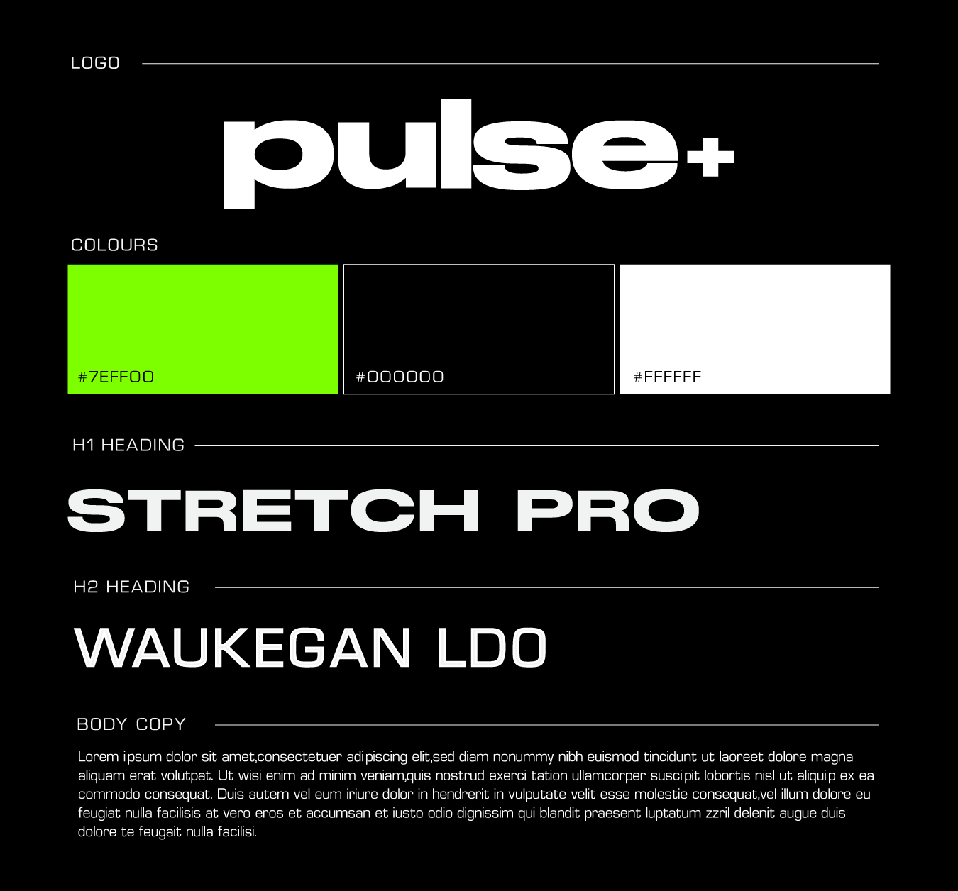
BRAND SYSTEM
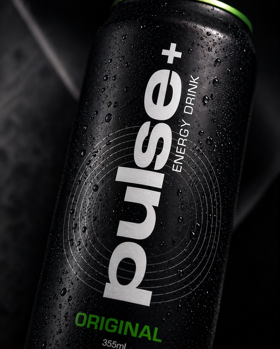
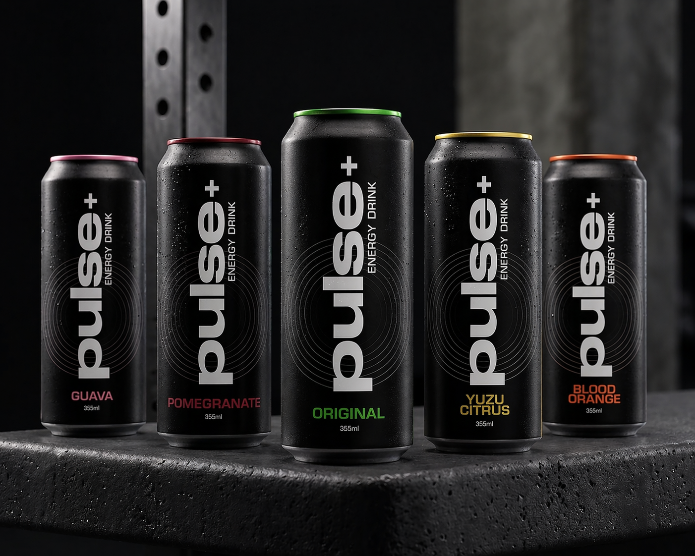
A minimal foundation defines the identity, using a bold wordmark and a restrained typographic hierarchy to ensure strong recognition across all touchpoints. The visual language prioritises legibility and structure, allowing the product and campaign visuals to carry intensity without clutter.
A controlled colour system is used to differentiate flavours while maintaining overall brand consistency. Each colour is applied with restraint, reinforcing a clean and premium aesthetic rather than overwhelming the composition.
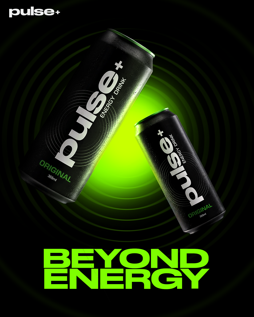
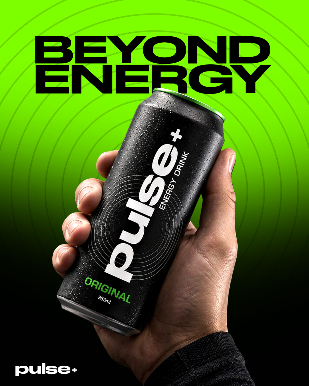

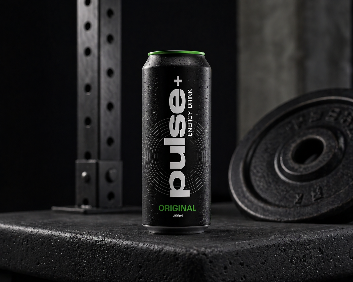
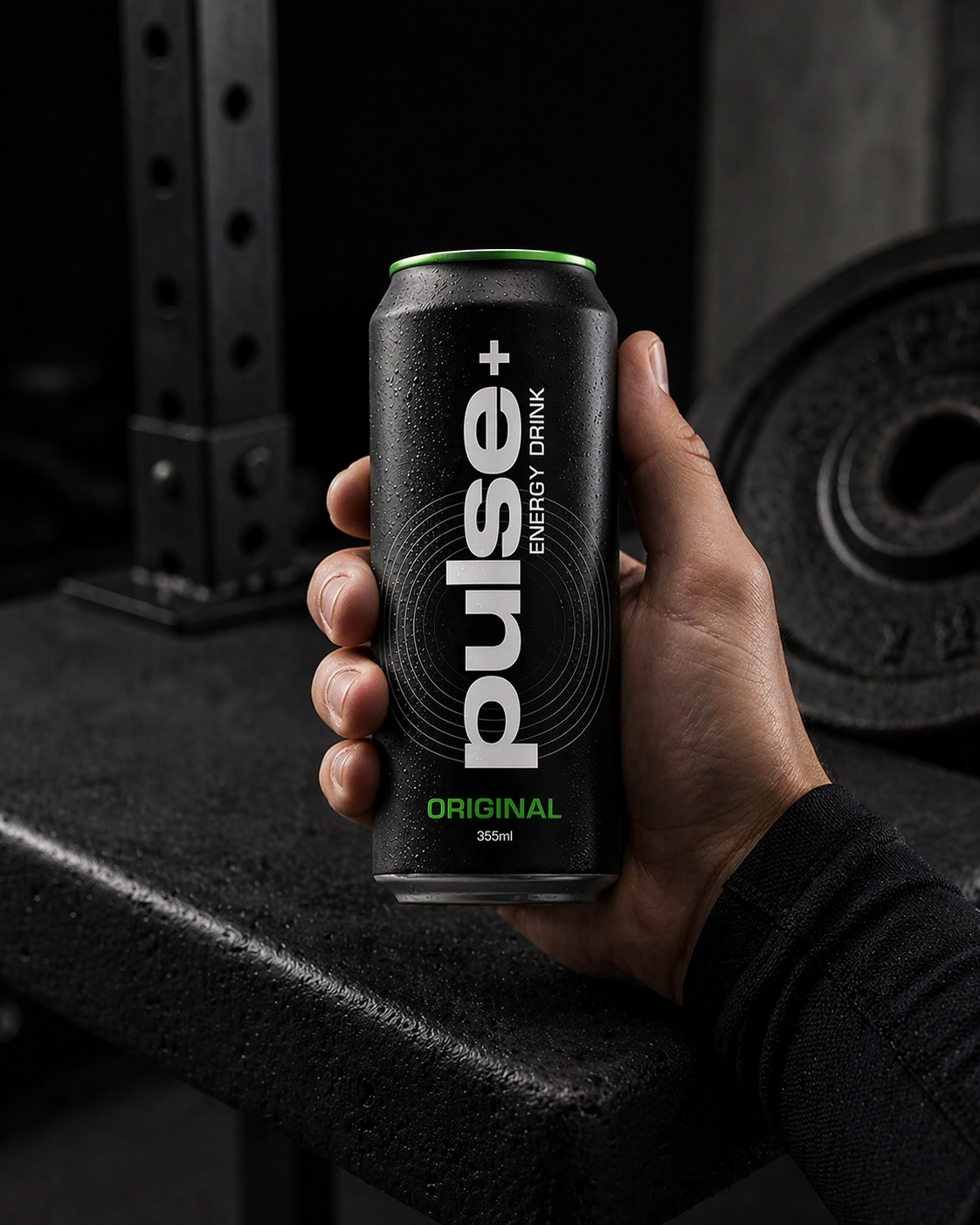
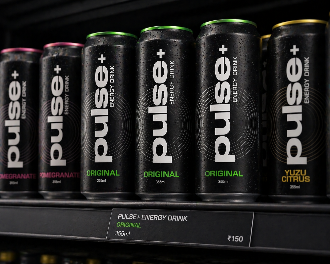
The product is applied across retail and lifestyle environments to demonstrate real-world presence and shelf impact, ensuring the design translates beyond static visuals.